1. What is the best sales page?
A sales page exists to make a visitor turn into a client. It does this by clearly demonstrating how your service or product solves its particular product benefits and its product. While the definition of a sales page is general, many resources go into creating a great sales page.
2. What is a best sales page vs. a landing page or homepage?
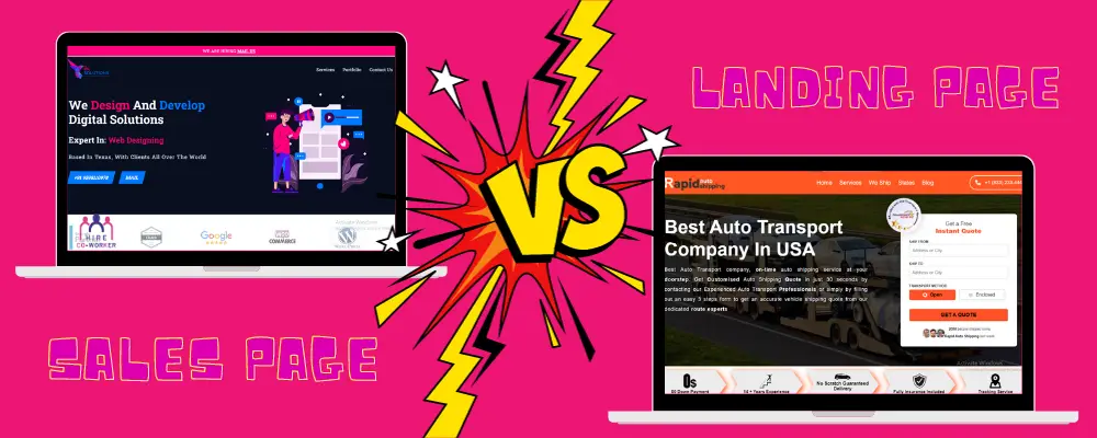
A sales page and a landing page are explicitly crafted to encourage people to convert. While landing pages are virtually the same as short-form sales pages, long-form sales pages are more detailed than a typical landing page. Still, home pages are entirely different from sales pages.
That's why the goal of a homepage is more than just to drive conversions. They attract a much wider audience, and with generic language and navigational tabs, they want to be tailored to convert a particular client the way a sales page is.

3. How many types of best sales landing pages?
Best sales landing pages are of two types:
1.Short-form sales landing pages: include a short yet catchy description of a service or product. These aim to drive inquiries as fast as possible and offer all the essential information for visitors to understand what they are getting. Short-form pages are affordable products, ideal for simply targeting warm leads.
2.Long-form sales landing pages: These pages offer a detailed description of a service or product. They aim to familiarise visitors with the promoted services or products thoroughly. Establish trust and encourage more purchases. Long-form pages are excellent for more complex, premium items that target a cold audience.
4. How do you know which format is best for your business?
There are merits and demerits to both. Long-form sales pages are unique because they allow you to:
- Show them that you know and realise their pain points and Build a strong relationship with the reader
- Show off the benefits of your items, dive into underlying pain points, and answer objections.
Still, long-form sales pages also have demerits because some people would only want to read part of the page, and the core value and call to action of a simple item are easily lost. Additionally, you might lose some impulse purchases.
Therefore, the merit of short-form sales pages is that they allow you to:
- Fastly communicate the value of the item if the reader is in a hurry
- Provide a concise review that can easily be shared with friends or colleagues
Ultimately, the kind of sales page you choose to create comes down to the offer you have.
Generally, a shorter landing page is ideal for a product or service that is:
- Self-explanatory or Simple
- Relatively low time investment
- Relatively low cost
Generally, a long-form landing page is ideal for a service or product that is:
- Relatively high cost
- Complex
- Time investment/Ongoing commitment
5. How to create the best sales landing page?
Maximum people drive traffic to their sales pages from email, a website, social media ads, Google ads, or creating a sales page. Therefore, you want a post-click landing page software to host your sales page.
Fortunately, there are a few sales landing page software options that are easy to use and do not require coding knowledge.
Below is an overview of the three most popular ones, and while they have slight differences, all of them are easy to use and do the same job.
6. How do you design the best sales landing page?
The uncounted success of your landing page will depend on its design. Great landing pages are simple and visually arresting, directing viewers towards a single action. Taking some time to get to know the principles of good user experience design is a good idea before you jump into building your first best sales landing page. But if you do not have time, here are the main things you should know:
- Make it simple
If there is one golden rule when designing a landing page, this is simplicity. Simple design, Simple copy, and a limited number of possible actions. Whether you are requiring your user to click on a button or fill out a form, the step should be evident from both the layout and the copy of the page.
- Mind the fold
Although most people today tend to scroll down through web pages, recent research suggests that what appears first in a browser still gets the most attention. Information that appears below the fold or at the bottom of a visible web page before scrolling gets less attention—so make sure your most important information is at the top. Encourage users to scroll down if needed by avoiding false floors or design that gives the illusion that the information on the screen is all there is.
- Choose right (call to action).
A call to action is a short phrase or button that tells your user what they should do. But good calls to action are also persuasive—they tell the user why they should do it.
- Cut your copy
When you are excited about your service, you want the world to know all about it. But it is a good idea to remember that others will want some convincing. Maximum people looking for headlines tend to skim through sites—so make your copy stand out visually by separating it with plenty of white space.
- Accessible (Make it)
Ensure everyone can digest the information on your page, including people who are colourblind, hearing impaired or visually impaired. Add a transcript of the video as an option. Good alt text for photos helps visually impaired people understand what the photo is trying to communicate If you have a video on your page.
- Unity and Balance contrast
While it is true that great design wants contrast to work, too much difference can make your layout confusing. Achieving a stellar design is all about unity and balancing contrast so that the essential elements can stand out.
While it is true that great design wants contrast to work, too much difference can make your layout confusing. Achieving a stellar design is all about unity and balancing contrast so that the essential elements can stand out.
- Creating a visual hierarchy.
How you balance unity and contrast is equally as important as doing it in the first place. Visitors to your page would not automatically understand what detail is the most important—so to guide them, make the most important details stand out as much as possible. There are several ways to do this, such as making the most essential, leaving a lot of white space around your call to action button, or texting the largest.
- Add meaning (Images)
Since the copy on a landing page wants to be short, photos are an excellent opportunity to give your user extra details without wanting to explain them. You can use photos that interact with your text or a grid that creates a narrative as a background for your product. However, if you use images, remember to optimise them for the website so your page loads quickly. Run a fast checkup via the website auditing tool to see if your files want to be optimised and if any technical issues prevent your landing page from gaining traffic.
7. How do you choose the best landing page creator for you?
When choosing the best landing page creator, assess the tool's learning curve. If you are a fresher looking to set up the best landing page swiftly, then an easy tool is ideal. But if you have sought to learn advanced features and the time that will take time to master, then a more complex tool makes sense.
8. How long should a best sales landing page be?
Some claim that short-form copy is always better. Long-form sales pages are often necessary for Concise, which is a smart move in many cases. A best sales landing page has to give potential clients everything they want to commit to a purchase. Depending on your pricing, how familiar they are with the solution you are offering and other elements, they may wish for many details before they feel comfortable buying.
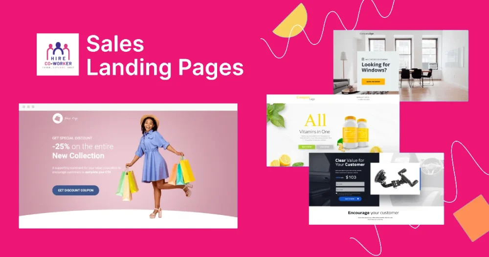
9. What are Sales landing page examples?
Sales page examples are:
- Amazon (for e-commerce)
- Netflix (for entertainment)
- Blow LTD.(for beauty)
